ScreenFonts: February 2018
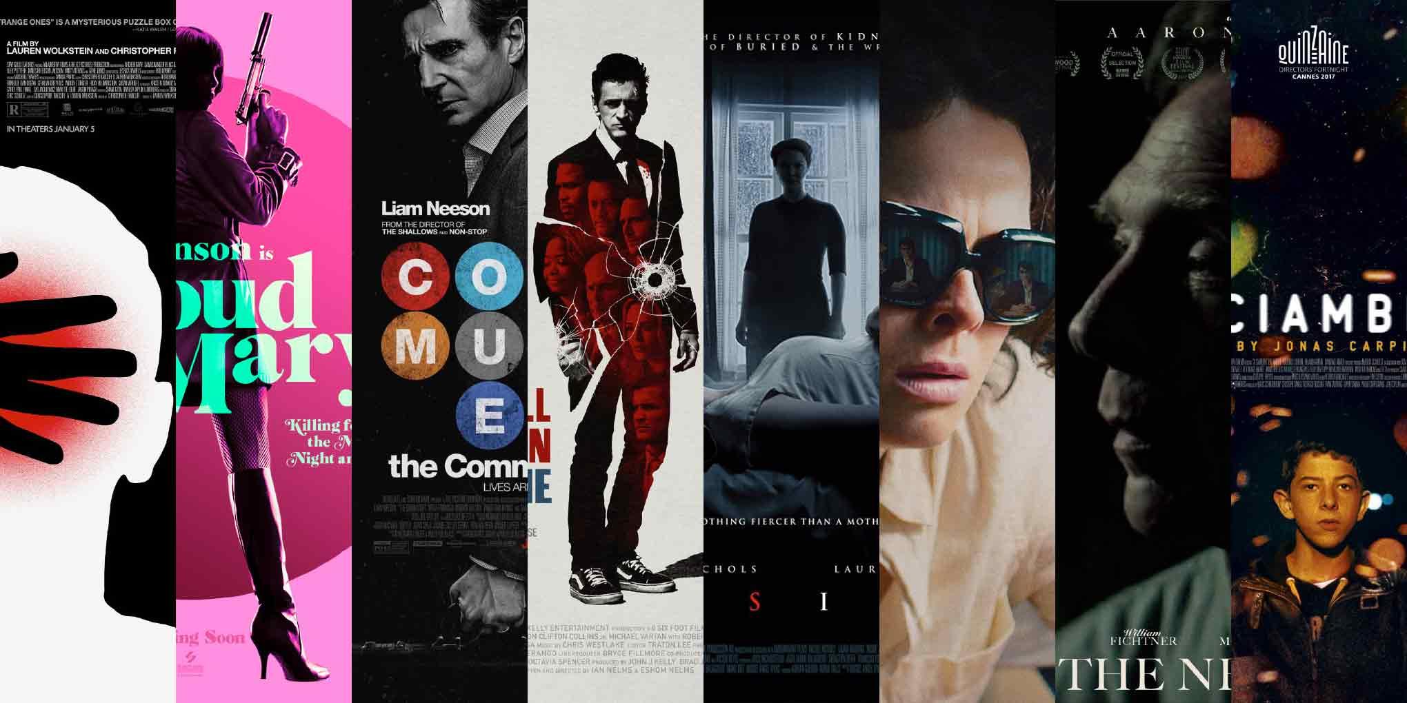
Murder and mayhem, and some interpersonal tension: this episode looks at posters for The Strange Ones, Proud Mary, The Commuter, Small Town Crime, Inside, Dim the Fluorescents, The Neighbor, and A Ciambra.
This episode of ScreenFonts turned out to be rather violent, with references to guns, flights and chases, conflict, manslaughter, stalking, and other assorted unpleasanteries. January also happened to be a rather lean month on the film-poster front. Be sure to lick your plate, because there will be no Leftovers this time.
I hope you’ve had your fill this month—I wouldn’t want your hunger for leftovers to make you hallucinate colored flecks of light. Sorry, there’s simply nothing left to snack on until the next episode’s main course. ChowCiao for now!
Bald Condensed, né Yves Peters, is a Belgian-based rock drummer known for his astute observations on the impact of letterforms in the contemporary culture-sphere. A prolific writer on typography, he has a singular knack for identifying the most obscure typefaces known to humankind.
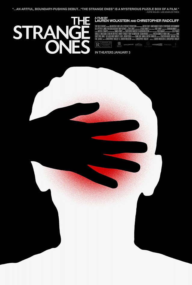
The Strange OnesThe Strange Ones follows two brothers as they travel through rural America, yet what appears to be a simple vacation soon gives way to a dark and complex web of secrets. Adam Maida’s minimalist poster aims to capture the film’s central themes of identity, trauma, and the main character’s questioning of reality. In an email exchange, Maida elaborated: “To further unpack these themes, I wanted the image to reflect [the protagonist’s] tumultuous relationship with his guardian-like older brother. His assumed role and the validity of the story start to disseminate into the blurring of dreams, memory, and being.” Maida cleverly plays with form and counterform to create an equivocal image. The red flare in the head’s silhouette seems to symbolize trauma—but should we interpret the hand as soothing and supportive, or malicious and manipulative? Maida chose Today Sans to support his empathic artwork. Conceptually, this was a wise decision, and yet, in my opinion, the line quality of the art calls for a humanist sans with a little more tension and contrast, like Amira. |
Proud Mary |
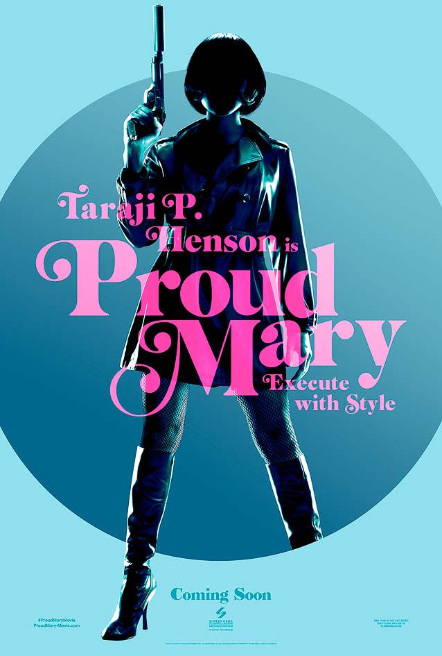
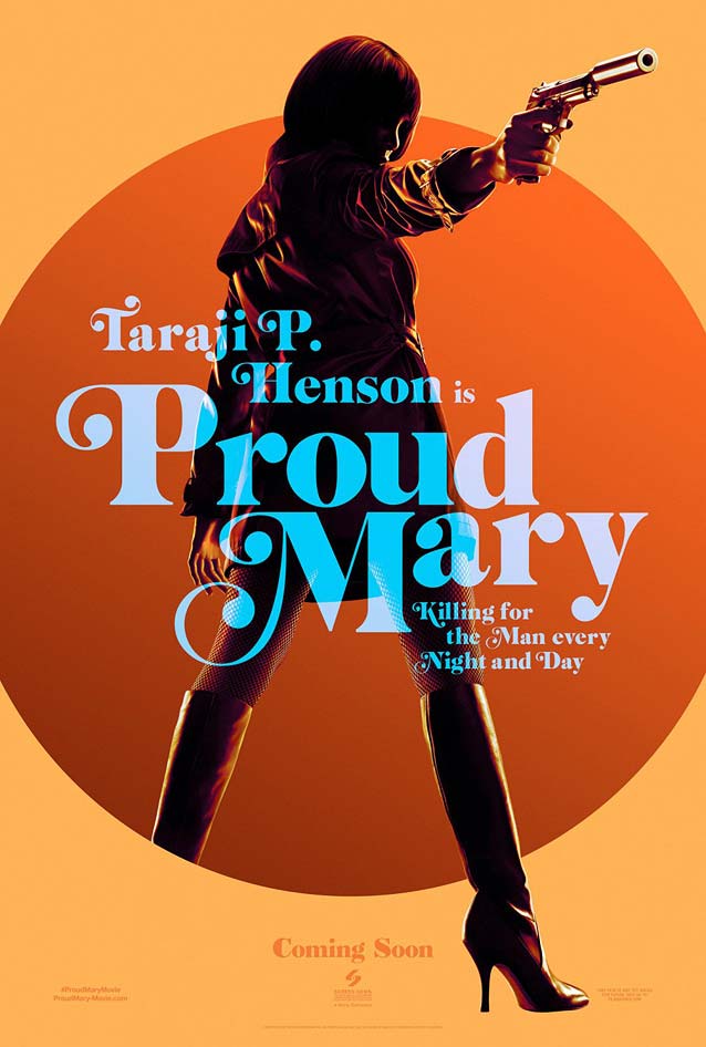
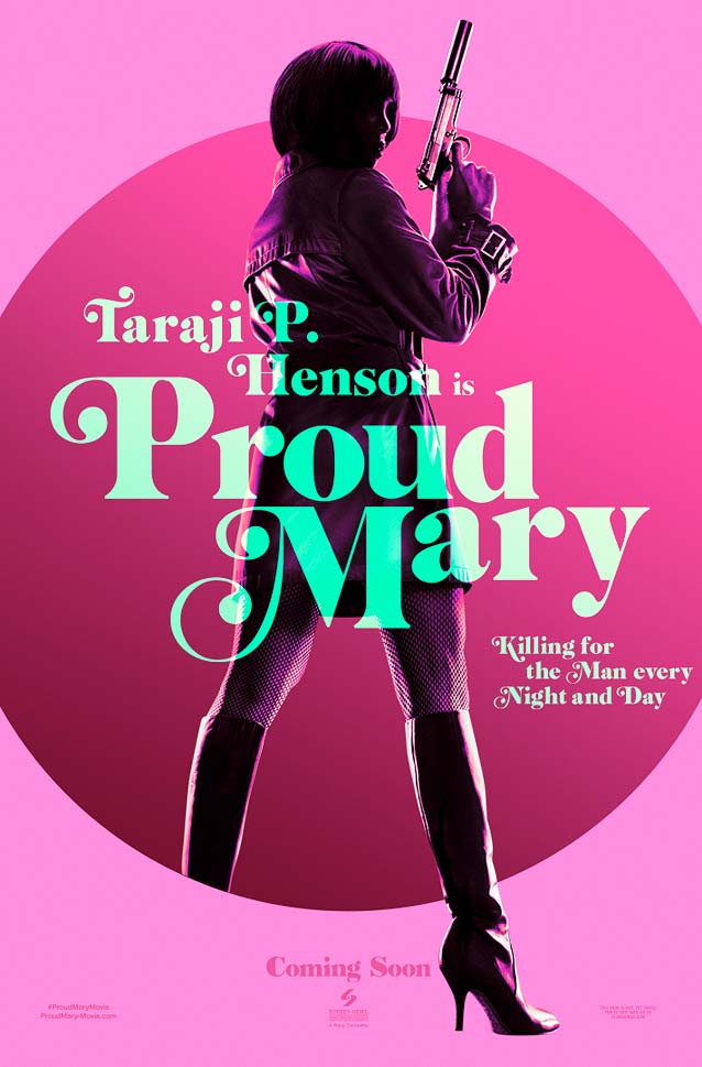
LA’s beautiful teasers for the crime thriller Proud Mary unapologetically revel in their seventies blaxploitation vibe. Clearly, they take their cue from the iconic 1974 Foxy Brown one-sheets. Rather than simply imitating their visual style, though, the artwork for Proud Mary adds a level of sophistication with its vibrant colors, stylishly backlit photography by Cullin Tobin, and translucent typography. In this instance, I appreciate the lack of yellowed paper, fake creases, and mock stains and rips that too frequently haunt similar homages. The typeface looks authentic; it’s probably Cabernet, Jason Walcott’s ornate fat face based on Caslon Black Swash. Ed Benguiat’s swashalicious high-contrast interpretation of Caslon for Photo-Lettering, Inc. was used in the original Foxy Brown posters, and later reprised in the marketing collateral for Quentin Tarantino’s 1997 tribute Jackie Brown, which also (like the original) stars Pam Grier. For a more dignified display Caslon, look no further than Matthew Carter’s exquisite Big Caslon. |
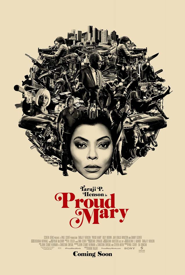
Rather than referencing the Foxy Brown film posters, LA’s main theatrical poster channels Pam Grier’s smoldering gaze on the sleeve for Wille Hutch’s original motion-picture soundtrack album. Instead of creating a smorgasbord of action scenes in the background, which is typical for retro action-flick posters, creative director Brian Christensen and art director Truc Le used those elements to compose an elaborate afro for star Taraji P. Henson. The overall effect is dramatic and powerful, and turns her into a proud, mighty goddess of vengeance. The typography, however, leaves something to be desired. Seeing the lockup isolated this way makes it painfully obvious how awkwardly the words are spaced. The initial P and end-y seem to be floating away, while the o and u pair almost crash into each other. It shows how important spacing and kerning is, and how a poorly spaced font falls apart into a mere collection of letters that don’t work well together. |
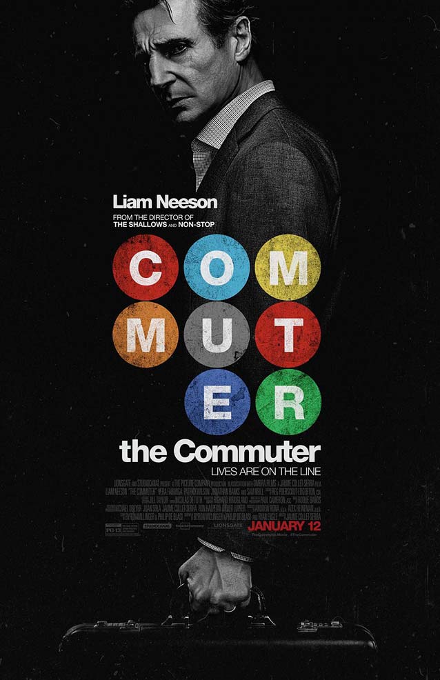
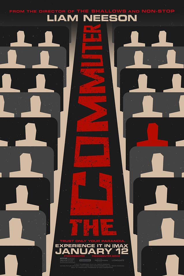
The CommuterIn the action thriller The Commuter, a businessman is caught up in a criminal conspiracy during his daily ride home. When the storyline provides such prime source material, it would be foolish not to mine it for the visuals. LA found inspiration in Massimo Vignelli’s legendary wayfinding system for the New York City subway, expertly analyzed and annotated by Paul Shaw in Helvetica and the New York City Subway System. The main theatrical one-sheet remixes the iconic colorful dots to form the movie title; the tightly-tracked knocked-out text on the dark grayscale image recalls the subway system’s white-on-black signage. Christian Schwartz’ Neue Haas Grotesk, originally developed for an abandoned Guardian redesign, remains without question the most faithful reproduction of the original drawings for the typeface later renamed Helvetica, and is available in Display and Text optical sizes. |
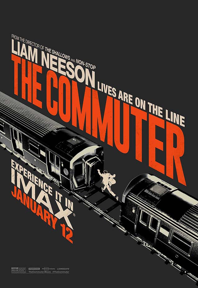
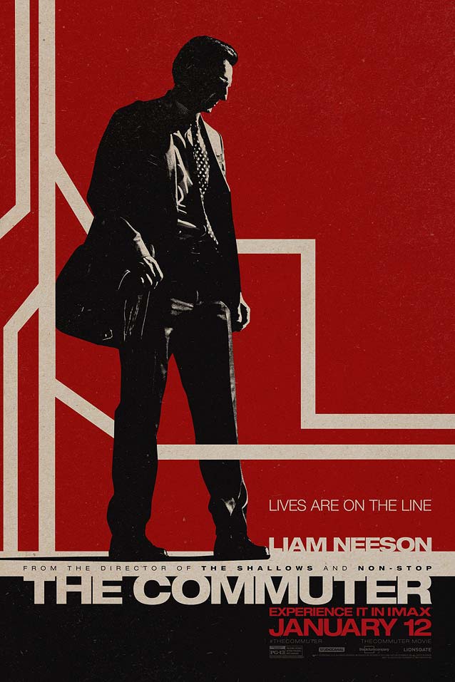
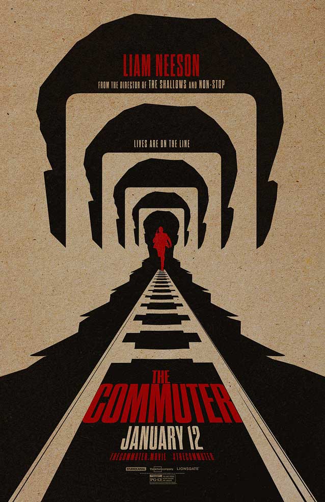
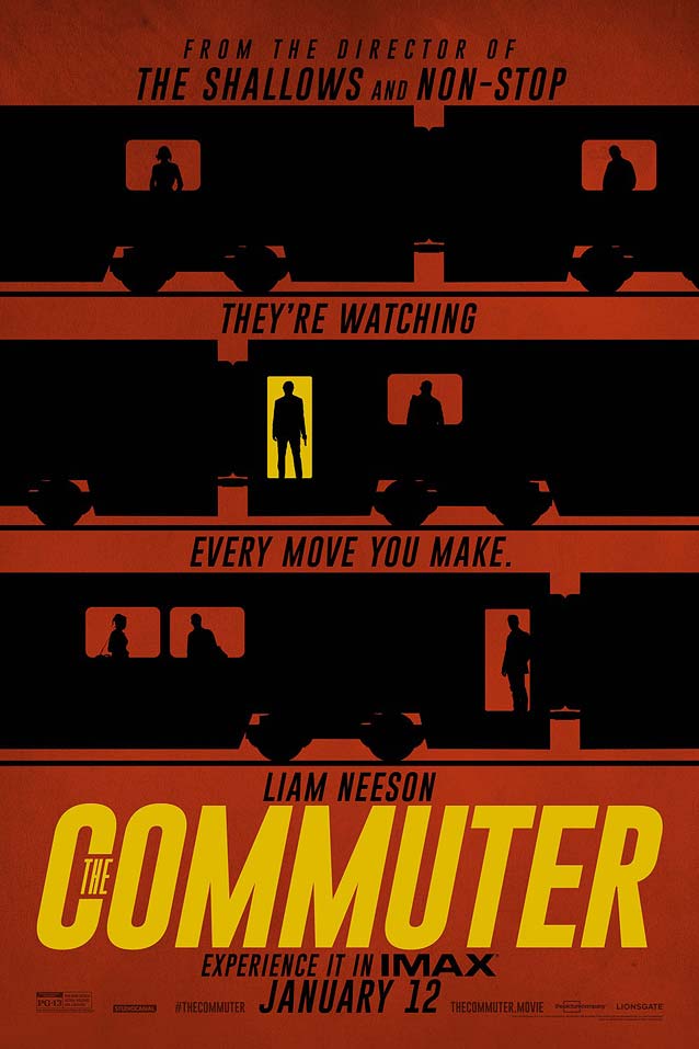
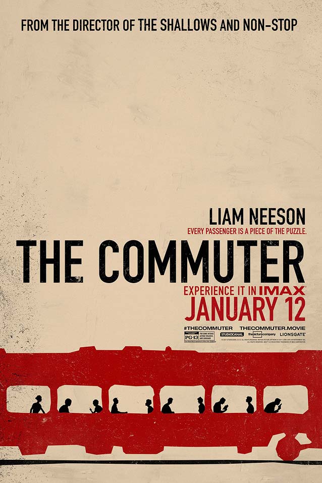
LA created a whole slew of internet posters, most of them animated. They all adopt a vintage look by simulating rough printing on kraft paper, complete with nicks and scratches, in high-contrast black and red with the odd yellow detail. The complete series is well worth exploring on LA’s website. |
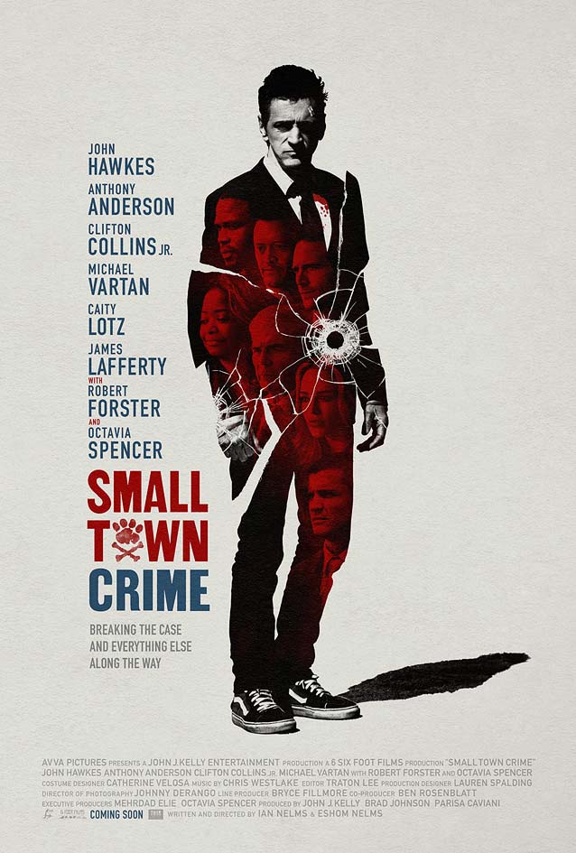
Small Town CrimeThe theatrical one-sheet for indie mystery Small Town Crime combines two well-worn movie poster tricks. On one hand, the monochrome red headshots inside the high-contrast silhouette help escape the curse of the floating heads. On the other, the bullet impact shattering that silhouette efficiently communicates that it’s a crime movie, and that the main protagonist is figuratively fractured. The overall image is striking, especially with the figure against a plain background with all type arranged vertically to his left, but the cracks make the portraits hard to recognize, somewhat negating their purpose. Still, this is a very appealing, strong design. The slightly irregular letters of the movie title are inspired by vintage wood type. David Berlow’s Rhode taps into that same spirit, offering a wide range of widths and weights—the corresponding variant would be Medium Condensed. The animal-paw-and-crossbones standing in for the O is a cute detail. |
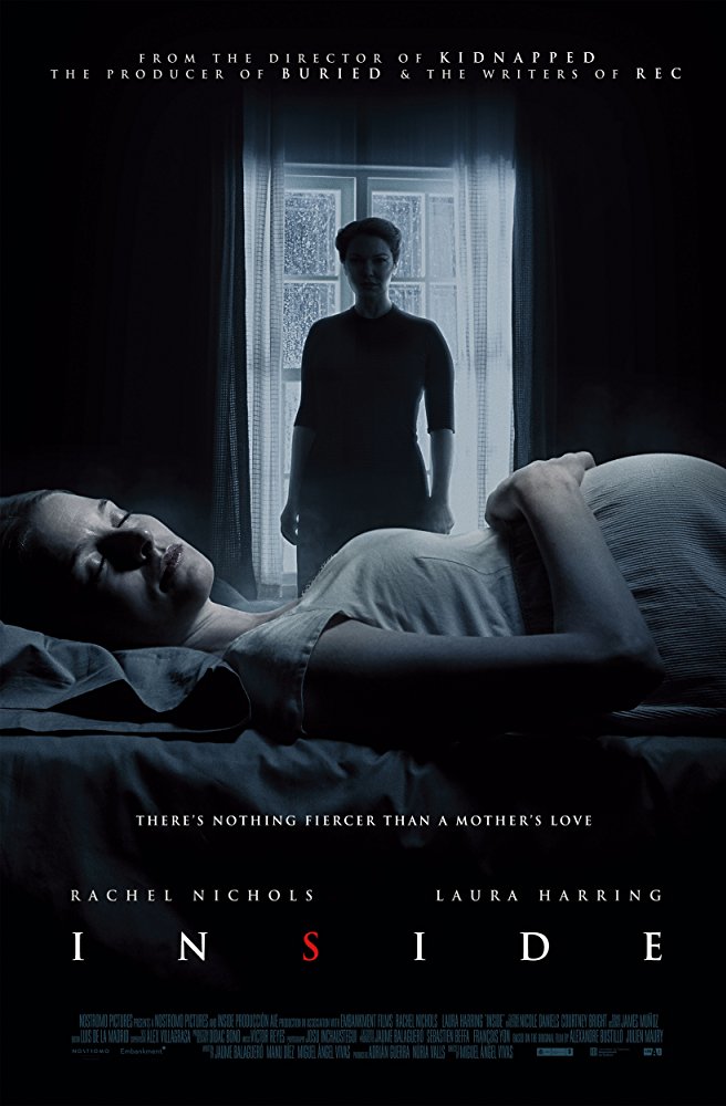
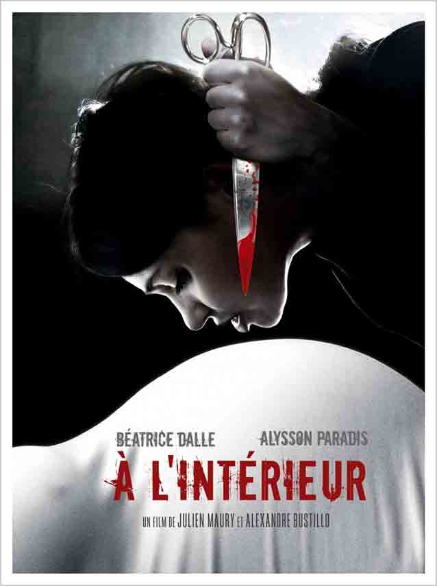
Inside / À L’intérieurI have a love-hate relationship with French film-poster design. There are moments of wonder and delight, hilarity and joy, even genius—but boy, do they often have crappy typography. Because Inside is an American remake of the decade-old French movie À L’intérieur, I wanted to compare the two films’ artwork. The French original, about a woman in her third trimester of pregnancy who is stalked by a stranger obsessed with her unborn child, is rumored to be the goriest, most violent home-invasion movie ever made. You really can’t tell from the poster for the American remake how it measures up against the original. The unimaginative visual of a woman in a dark room watching the peacefully sleeping protagonist doesn’t conjure up even the slightest sliver of suspense. It’s a horror poster, so Trajan is a predictable choice. Canto, Richard Lipton’s interpretation of Roman capitals similar to those engraved at the base of the Trajan column, is an expansive alternative, offering three flavors in several weights with a full lowercase complement. |
The visceral poster for the 2007 French movie is something else. Without explicitly showing anything horrific, the poster abstracts implicit violence into a highly stylized, disquieting image that still manages to chill you to the bone. The artwork foregoes realism in favor of immediacy. It only features the bare elements necessary to understand what the film is about: a woman seemingly levitates above a pregnant belly so closely that she almost kisses it, intently staring at it, a bloodied pair of scissors in hand. Gravity, anatomy, and physical space be damned—this approach sure pays off, because the one-sheet communicates dread extremely effectively. But yeah, the typography… The grunged-up narrow sans—a freeware “remix”—is so on the nose it’s annoying. The identical wear and tear on repeating characters (I, E, and R) comes across as lazy. Just use a proper typeface like Benton Sans Extra Compressed Bold and, you know, mess it up. |
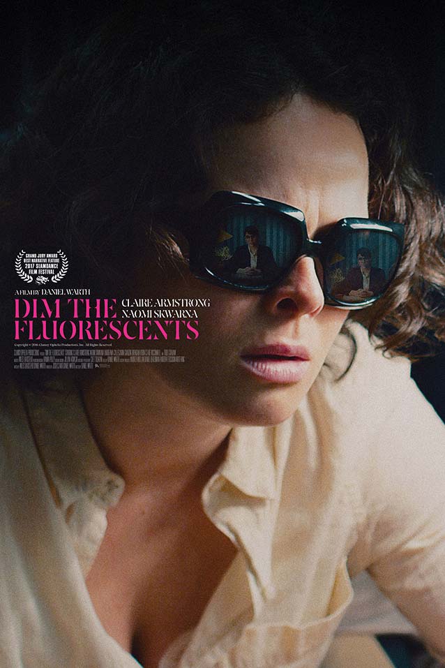
Dim the FluorescentsAnother thing that irritates me is visiting a designer’s website and discovering that they authored excellent posters for films I discussed the previous month (see below). The main theatrical poster for Dim the Fluorescents impressed me with its directness. The movie tells the story of a struggling actress and an aspiring playwright pouring all of their creative energy into the only paying work they can find: role-playing demonstrations for corporate training seminars. Midnight Marauder chose to focus (literally) on the two main characters. A close-up portrait of the playwright fills the entire canvas. The photo is left mostly untouched, with just a concentrated block holding all the textual information at eye level, drawing the viewer’s attention to the reflection of the actress in the playwright’s sunglasses. I was pleasantly surprised to see Raphael Boguslav’s lovely stencil face Avia used for the movie title. The typeface is currently in transition between libraries; although it no longer appears on our website, Avia can still be licensed from Type Network upon request. |
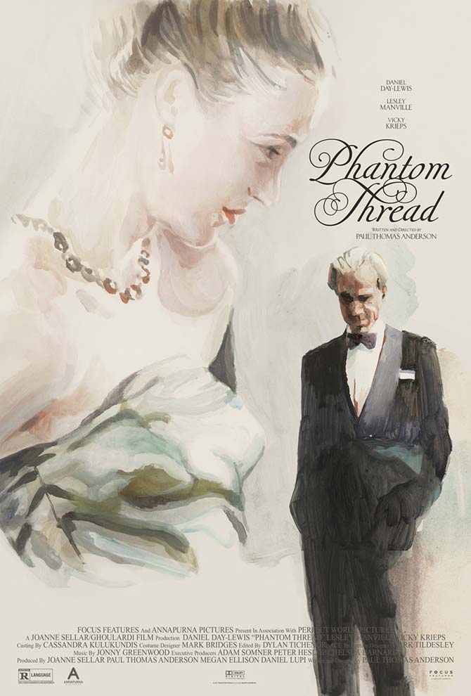
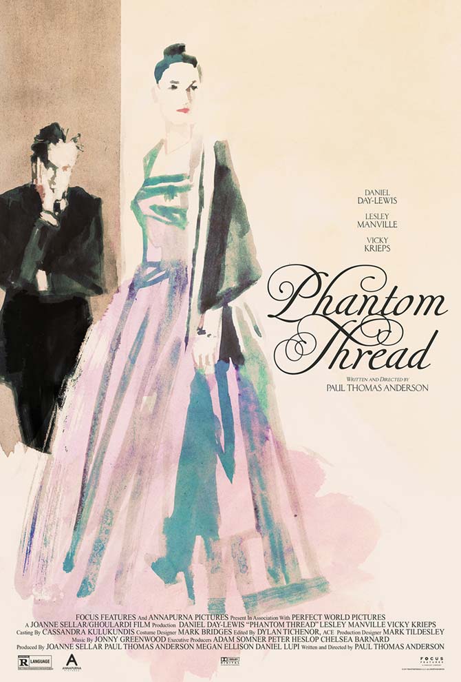
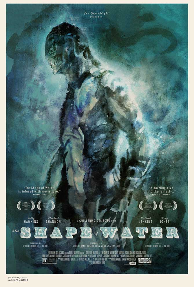
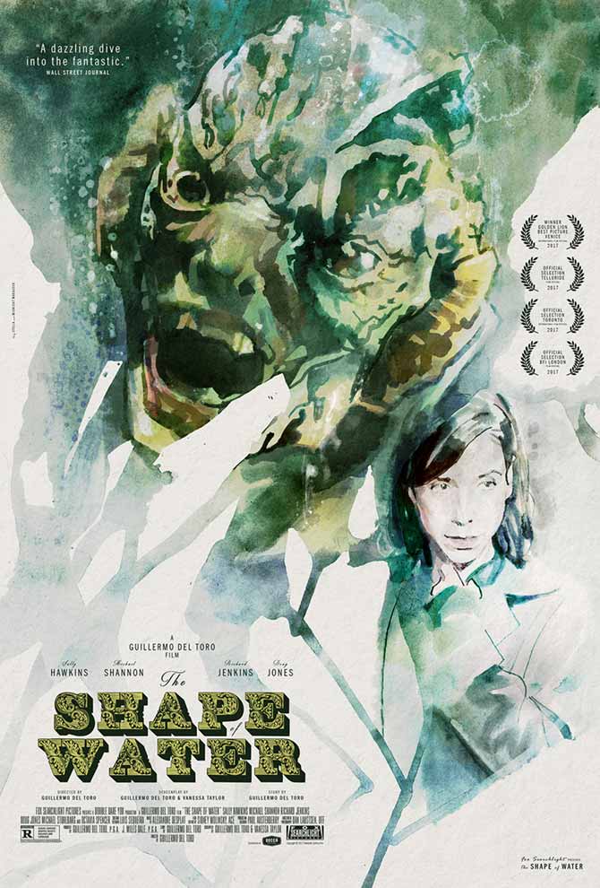
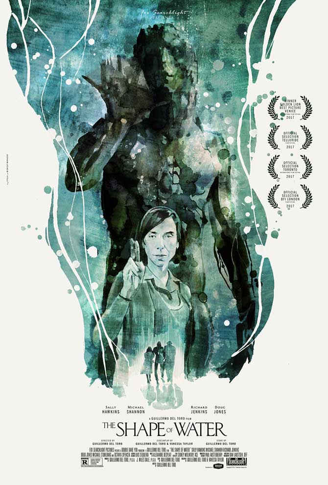
When visiting Midnight Marauder’s website for this month’s ScreenFonts, I was a little frustrated to discover gorgeous alternate posters for Phantom Thread and The Shape of Water, both reviewed just last month. They feature expressive watercolor art by Tony Stella, an Italian illustrator who works in Milan and Berlin. The painted art is embellished with Midnight Marauder’s thoughtful design and typography: a curly script similar to Retype’s virtuoso Krul for Phantom Thread and a delightfully ornate Victorian slab serif in the top two posters for The Shape of Water. If you like the vintage flavor of the engravers’ capitals in the bottom one, consider Grand Central or Meyer Two for evoking this atmosphere. |
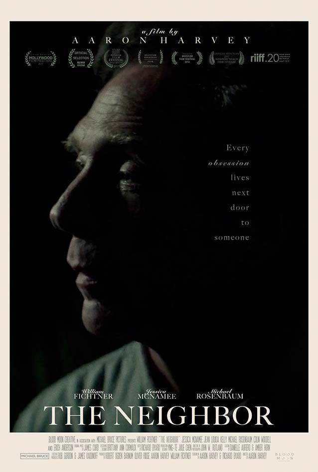
The NeighborSimilar to Midnight Marauder’s theatrical one-sheet for Dim the Fluorescents, this uncredited festival poster for The Neighbor homes in on the titular character: a middle-aged man in a stagnant marriage who finds his life upended when an attractive young woman and her seemingly abusive husband move in next door. The strong tonal contrast between light and shadow can be traced back to the classic chiaroscuro technique from the Renaissance. It creates a dramatic atmosphere tying in with the film’s central themes of obsession and stalking. Both primary typefaces on this poster are by type-design legend Matthew Carter. The main type is Big Caslon, his crisp, refined interpretation of the iconic English transitional face. Carter calls it a “revival of a revival,” since it relies upon both eighteenth- and nineteenth-century versions of Caslon. The secondary typeface is his classic 1965 design Snell Roundhand, based on the roundhand script of eighteenth-century writing master Charles Snell. |
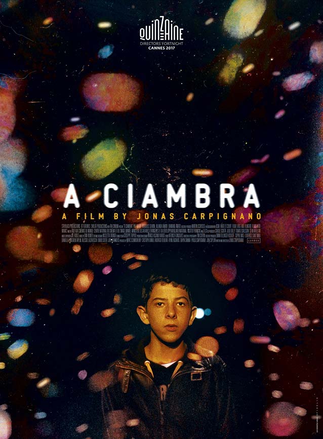
A CiambraFrench design studio Le Cercle Noir outfitted coming-of-age movie A Ciambra with a dreamy theatrical one-sheet that flirts with magical realism. The polychromatic spots of light seem to be a mix of the recent trend of sprinkling action-flick posters with fiery embers and the photography technique known as bokeh. This multicolored cloud of lights has a surprising effect on the viewer: while the majority of the canvas consists of shimmering, out-of-focus psychedelia, it inexorably draws the attention to the resolute portrait of the young boy, making it a point of laser-sharp focus. The rounded tech sans 232 MKSD Round by Maniackers Design is a commendable but somewhat flawed effort. Newlyn’s New Zen is a more accomplished take on the genre; his New Rubrik and Type-Ø-Tones’ DINosaur offer wider alternatives. |